Saturday 17 October 2015

Typography Poster


Helvetica

Designer – Max Miedinger, assisted by Eduard Hoffmann
Category – Sans-serif
Classification – Neo-grotesque sans-serif
Foundry – Hass Type Foundy
Date released – 1957


Helvetica
Helvetica is a commonly used type face that was developed in 1957 by Swiss designer Max Miedinger with the assistance of Eduard Hoffman. Miedinger and Hoffmann designed a neutral typeface with high clarity with no real meaning in its form with the wide variety of uses in signage.

During this period, Hoffmann was the president of the Haas Type Foundry, while Miedinger was a graphic design freelancer, where the two had formerly worked together as Haas salesman and designers.

The sans-serif typeface is a neo-grotesque design that was based on the 19th century Akzidenz-Grotesk typeface originally released by the Berthold Type Foundry in 1896 which became one of the first sans-serif typefaces to be widely used. Developed by the Haas’sche Schrigtgiesserei (Hass Type Foundy) in Munchesnstien, Switzerland, it was mean to match the trend of and rebirth the interest in the turn-of-the-century grotesque typefaces with European graphic designers, which resulted in the release of Universe, created by Adrian Frutiger within the same year.

The influences of Helvetica includes Schelter-Grotesk and Haas’ Normal Grotesk which lead to the name of Neue Hass Grotesk which gained considerable attention on its release, this was adopted for widespread release. The name was changed to Helvetica (meaning Swiss in Latin) by the German parent company Stempel in 1960 as a mean of a more marketable name internationally. With intention of matching the success of Univers, Stempel redesigned the typeface into a larger family.

Helvetica has become one of the most used sans-serif typefaces, it is a common choice in commercial wordmarks for brands such as 3M, BMW, ECM, Mcdonalds, Motorola, Nestle, Panasonic, Skype, Target and Verizon. Apple also used Helvetica as the syste,m typeface of iOS used for their products.

In 2007 a feature-length film directed by Gary Hustwit was released that coincided with the 50th anniversary of the typeface.

Typeface Poster 1

Overall from my experience researching and using Helvetica for my studio project I now have a better understanding as to why Helvetica has become one of the most popular typefaces in history. The clarity and simplicity, the vertical and horizontal form of the strokes, the monotone weight of the lines, all culminate into a typeface that is both classic and modern that highly works in when viewed by the public eye, that is why I find that it fits perfectly with its current uses in advertising, signage and documents. It is clear and easy to read while also keeping a structured form that shows in design. Before applying this typeface to my posters I never thought anything of the font but with having a clearer understanding of its history and current uses in the public today I have more appreciation for Helvetica and what it has accomplished.


27th Alphabet Poster 1

When using the font in my posters the first thing that came to mind was the clean and structured form which I ended up focusing on with my first font poster but that resulted in a product that felt information heavy and cluttered, this resulted in a more minimalistic second attempt where I took away most of the information and played around with the font to add more of a playful vibe which I also took into account when choosing the image of the woman as I felt that it was playful but also elegant. The use of colours were chosen to feature an older style look and to add some depth to the design. As for the symbol poster If focused on a minimal design which featured negative space while having the 27th alphabet as the main point of view of the poster while also including a smaller section of information.


27th Alphabet Poster 2
Typeface Poster 2


Sunday 11 October 2015

Logo Symbolism


Playstation

When the Playstation brand was conceptualised in 1994 over three dozen logo concepts were presented for the final selection. The final logo which would become iconic in the gaming industry was created by Japanese designer Manabu Sakamoto who has also designed other logos for the company. The logo consists of four colors that were used to symbolise joy, passion and excellence. The logo consists of a font typeface that was designed specifically for the company.


This design has become one of the most iconic logos in the gaming industry; it is the logo that started the Playstation brand name. The choices of colours represent a hidden meaning which isn’t represented when viewed but after finding out the reason behind it supports the values its gaming console strives for. The logo conveys the name Playstation in short form, which the name PS has become a name its self for the future consoles that came after.


Walt Disney Pictures

The Company Walt Disney Pictures was founded by Walt and Roy Disney in 1923, it was not until 1985 when the first appearance of the Sleeping Beauty/Cinderella Castle which is iconic for the Disney theme parks was used as a logo for the company. The logo symbolizes a fairy tale world focused on providing quality entertainment to children.  Part of the Disney world’s identity as a message to have fun in a fairy tale atmosphere and over the year has maintained its exclusivity and success. Originally the logo featured the castle with a beam of light appearing behind it but over the years it has slowly developed, the first change was introduced in 2006 with the modification of the light into a shooting star, this can be symbolized as the iconic Tinkerbell or Blue Fairy.

Overall the reason why I chose to look into this logo is because it works well in representing the company‘s feeling and message, it is one of the examples why using iconic imagery associated the name can work so well when viewed and the slight modifications can add more meaning. It represents that magical feeling that comes with the Films they produce that is felt from audiences of all ages.


Burger King

First introduced in 1967 and mostly looks the same to this day. It incorporates two half buns with the brand name in the middle that acts as the fillings, the slight difference font size in the word King also enhances the visuals of the logo. The use of simple bright colors draws the attentions to the audience irrespective to age demographics. The swirl is there to encase the logo an unify the elements.

The overall I chose to look into this logo as I am a regular customer to this chain and normally chooses this over their competing brands. The logo feels vibrant and sparkles which is alluring to the audience. As this is a logo for a fast-food chain it works well in representing a positive feel of the company with the expectations of selling quality food, which is a reputation that fast-food chains commonly don’t get from the general public. The logos simplistic symbolism of the two half buns represent the message that this is a fast-food brand while using attractive colors and a swirl that showcases the entire logo is inviting.

Le Tour de France

Created in 2002 by designer Joel Guenoun this logo remains unchanged. It was introduced for race’s the 100th anniversary with a 100e underneath meaning 100th in French. The logo consists of name of the annual and vigorous biking competition, within the name its self it uses the letter R to represent a cyclist in racing position while using the O and the circle as the bike wheels, the letter U can also be interpreted as the bike seat. The use of yellow also signifies a sun as the event takes place in the day.
This logo stands out with its playful font that bursts out compared to other tradition typefaces and the use of symbolism within the slight colour and the design of the lettering to create the imagery of the cyclist help enforce the event behind the logo which can be recognised even with the French wording.


It is a simple logo that conveys the message and feeling of the event to the audience that this day is full of positive, joy while also showing that this is a competition with serious participants.


Apple

Created by Rob Janoff in 1977 this logo has become a symbol of knowledge. Many have taken this logo as a symbol of Adam and Eve as in the bible they are tempted by Satan to taste the forbidden fruit from the tree of knowledge, Eve gives in to temptation and takes a bite, with their first taste of knowledge they are aware they are naked and ashamed, the first bite represents the fall of man. The creator has claimed that he didn’t explicitly intend this meaning when he created the logo and that the inclusion of the bite was meant for scale so that people would understand that it was an apple and not a cherry. The apple is a symbol one of the oldest and most potent in Western Mythology. The use of the apple is a simple use of imagery that carries the weight of centuries of meaning, Apples use of the logo is powerful and their name and corresponding icon are known worldwide.

Apple has made a simple icon from its brand name which holds many meanings that can be interpreted in different ways, the symbolism of knowledge works very well with their products as it represents the use of their computers to obtain knowledge. By using something that has a long history of meaning makes it one of the more interesting and recognizable logos without using a more complicated icon.

Saturday 3 October 2015

Promote a Graphic Designer


Paul Rand

 
Born - August 15, 1914
           Brooklyn, New York 
           United States

Died - November 26, 1996 (aged 82)
           Norwalk, Connecticut
           United States


Paul Rand was an American graphic designer, who is best known for creating corporate designs such as the logos for ABC and Steve Job's NeXT, he was also one of the first commercial designers who embraced the International Typographic Style also known as the Swiss Style.


Before his career began Paul Rand started designing at a very young age by painting signs for his father’s store and at school events. He attended Manhattan’s Harren High School while also taking night classes at Pratt Institute as his father did not believe that art could be a liveable option. Though he studied at Pratt and two other institutes in New York he was known largely as a self taught designer learning from European magazines.


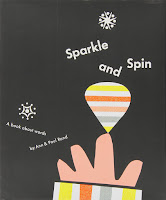
Sparkle and Spin (1957)
The Stork Club Bar Book (1946)


Paul Rand has a vast range of work that he has accumulated throughout his career ranging from book covers, posters, packaging and corporate logos. Some of his well known work includes the American Broadcasting Corporation (ABC) logo which he designed in 1962, the logo for International Business Machines (IBM) in 1956 and the NeXT logo for Steve Job’s computer company.

Throughout his career he would have large staff working with him but would continue doing a vast majority of the the design work as he was recluse in his creative process. He was also very interested in producing books that would highlight his philosophies.

Major influences were art philosophers such as Roger Fry, Alfred North Whitehead and John Dewey, the later being one of the most influential appeal of Art as Experience as he drew lines from Dewey's philosophy for his ground breaking book Thoughts on Design. 

With the rise of postmodernist theory and aesthetic in design, Rand caused criticism during his later career as he increasingly became more agitated with this development. Resigned his teaching position at Yale to protest the appointment of a postmodern and femist designer Sheila Levrant de Bretteville which he convinces one of his colleagues, Armin Hofmann to do the same.

He also received accusations from others work such as From Lascaux to Brooklyn (1996) which accused him of being "reactionary and hostile to new ideas about design." Rand's later ideas were supported by Steven Heller calling him "an enemy of mediocrity, a radical modernist" while others such as Favermann considers his ideas one of " a reactionary, angry old man." Still Rand's theory contribution is considered intrinsic to the development.


Eye-Bee-M (1981)
NeXT Computers (1986)

All though his corporate identities were the more well known designs that Rand contributed some which are still being used to this day, I find myself more drawn to his designs that he created for his collection of books that he worked on with his wife Ann Rand. I find that this style is more playful and represent a more approachable feel, with the paper cut out and textured appearance of his covers that are completely different from what he presents with his corporate designs which are much cleaner and structured which shows two different sides to his design style. Even with two different styles based on the type of work there are still similarities that can be seen in his corporate designs with the use of bold solid colours and the lively use of icon illustrations.


Reference

http://www.paul-rand.com/
http://collection.cooperhewitt.org/people/18042341/


Friday 2 October 2015

Who am I? - Creative Moodboards


Who am I?

That was the question that was asked this week. How would I visually represent myself as:

- An Individual
- A Designer
- Favourite Colours
- Favourite Typeface
- Inspiration and Aspirations

This is a range of moodboards that represent me in each category. These showcase different aspects from my personal values, design style and vision.

What makes me.... ME?
What are my design STYLES?
Why am I DRAWN to these colours?
What makes these typefaces ENGAGING?
Why do I want to be CREATIVE?